


Photo Shoot Outfit Planning Guide
Oh, THIS is Love!
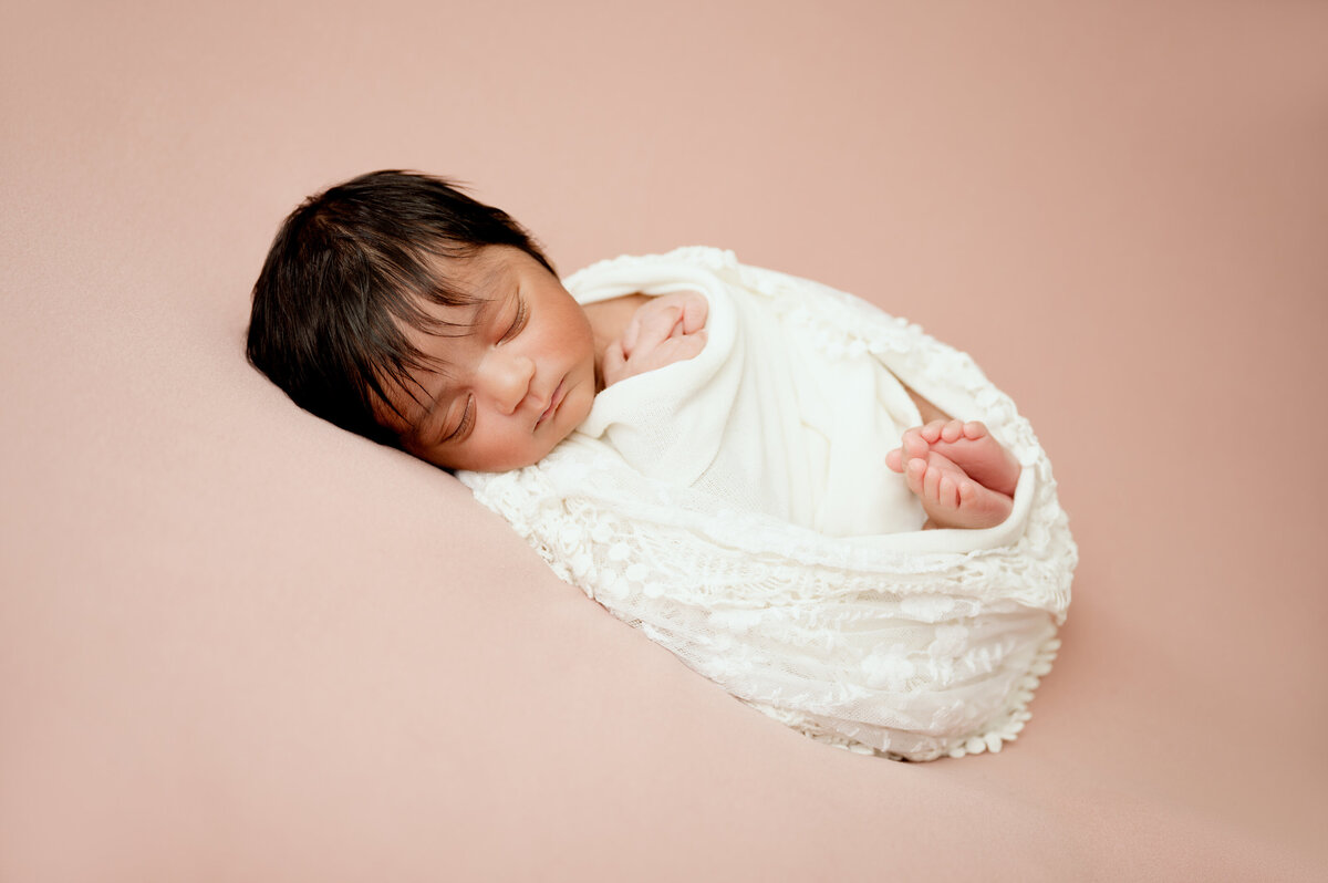
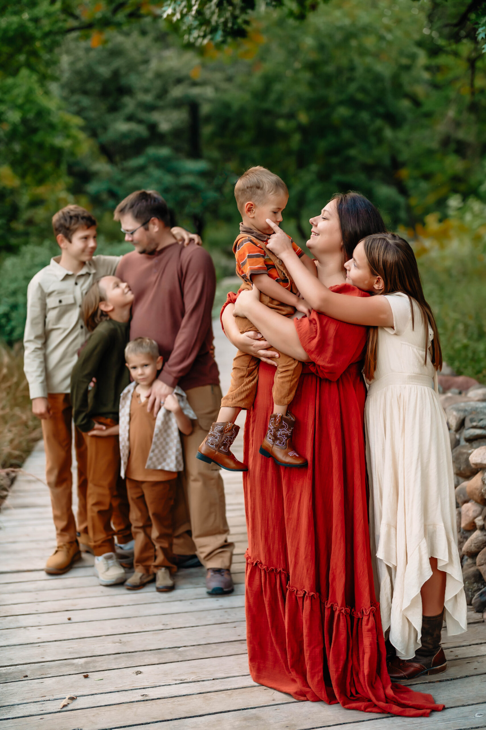
When planning your outfits for a family portrait or newborn session it’s good to keep in mind that complementary colors are pleasing to the eye.
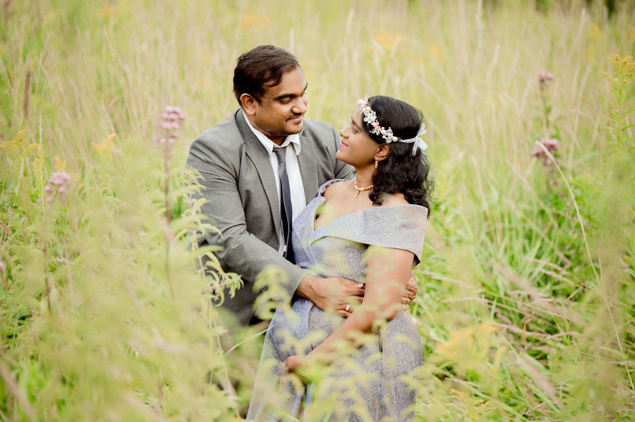
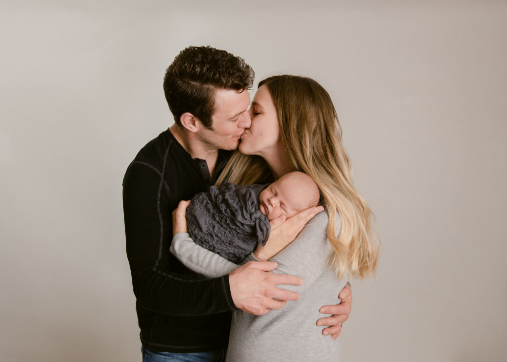
Coordinating ~ Not Matching
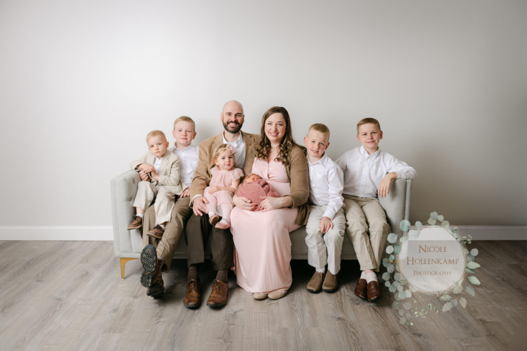
Another thing to keep in mind is to allow different patterns and textures in the clothing throughout your family’s outfits. It is very possible to match too much. So try not to go out to the store and buy everyone the same exact t-shirt in the same exact color and just in their size. Avoid having everyone wear blue jeans and the exact same shade. More Examples
Colors
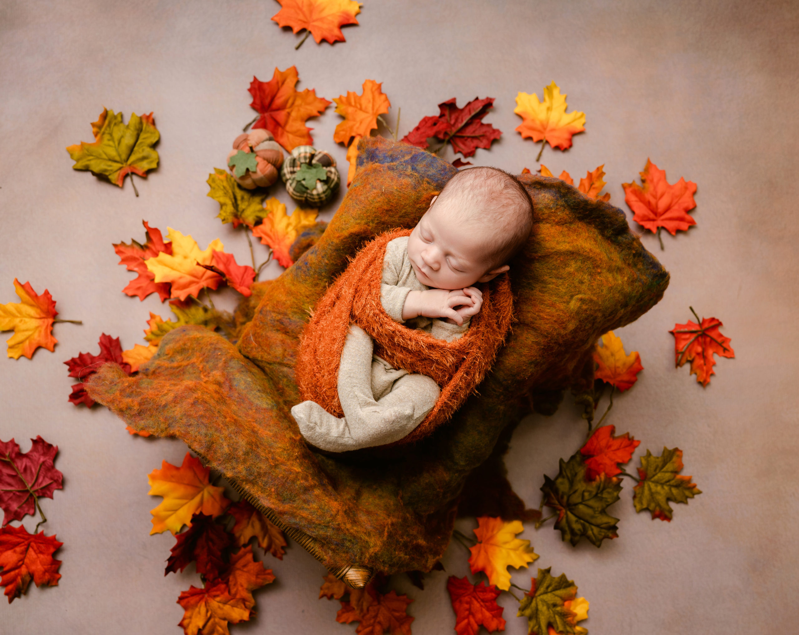
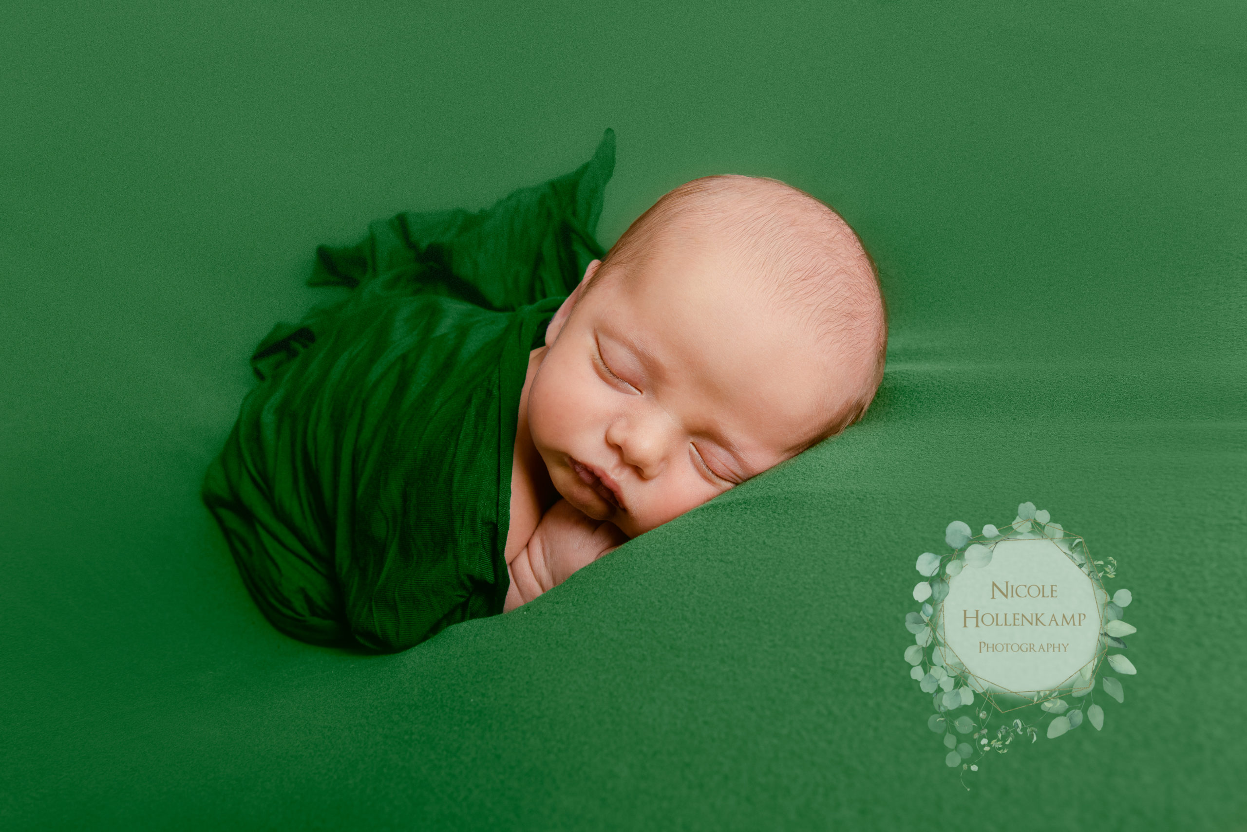
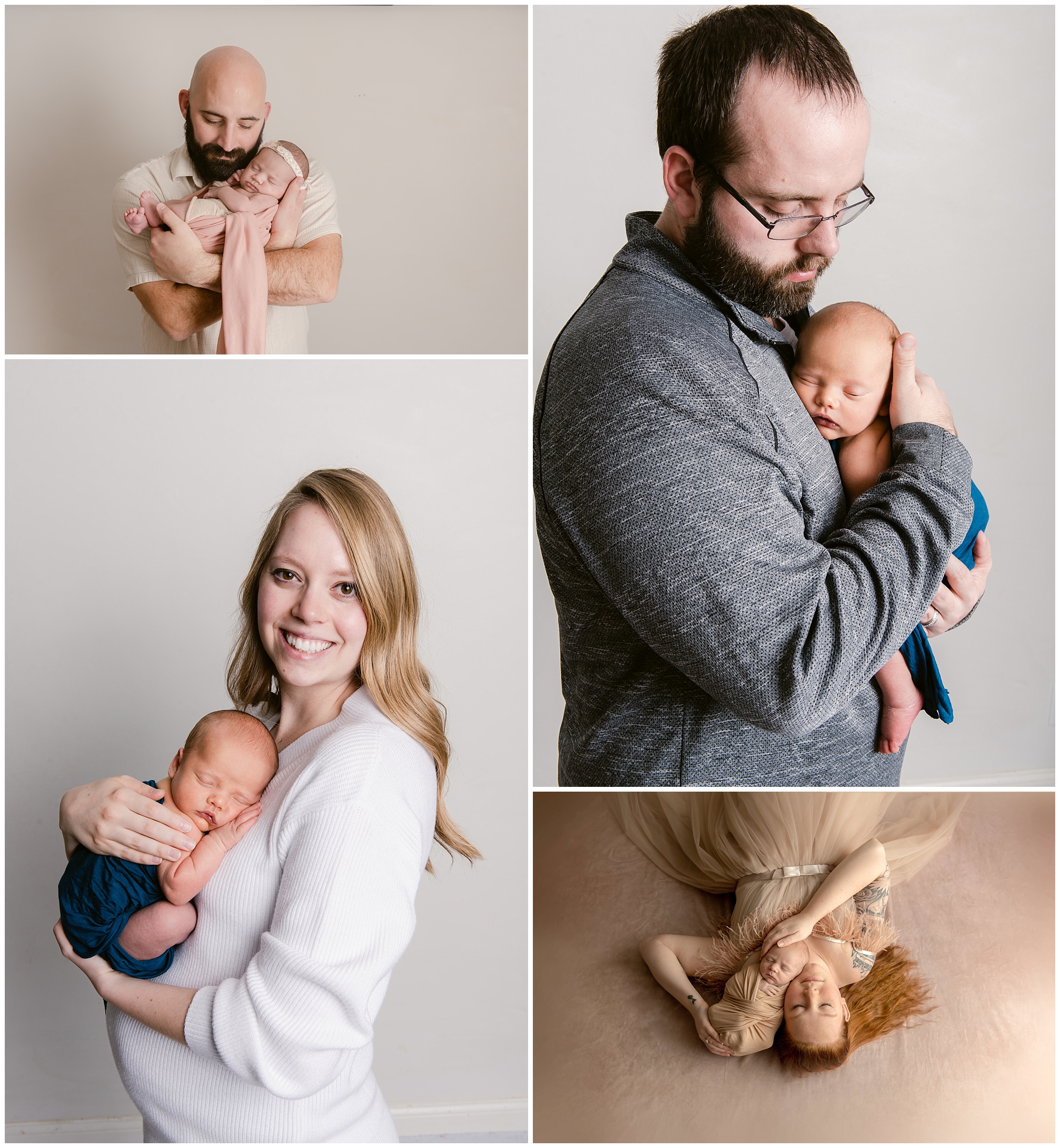
When choosing what colors to put into your outfits I always suggest looking at color palettes. Color palettes tends to be engineered in a way that is pleasing to the eye. You can have the girls wear a couple no complimentary shades of pink and purple and then you can work cream colors into their outfits.
As a general rule like goes with like. If you love dark deep saturated colors like plums and cranberry and navy and that sort of thing. The way that you photograph those those colors might be different than how we would want to photograph colors that are more of a desaturated pastel sort. So just try to be consistent if you’re going to put one person in a deep saturated color then let’s do deep saturated colors with everyone.
Remember the rule of three. Putting together lots of different colors can be very distracting and it can really make things not flow together very well. So you can choose three colors like white or cream and pair it with like a pastel pink and a baby blue and then you can work those colors throughout everyone’s outfits. So maybe you put your boys in different shades of like one can have a blue shirt with khaki pants the other one could have a cream shirt with blue jeans and then they could have like pink ties or you know just try to work out throughout each person’s outfit a little element of all three colors.
Patterns, Graphics & Textures
As a general rule for portrait sessions you want to avoid graphics on your t-shirts. If you’re going for a very grungy style with graffiti and tattoos and then graphic t-shirts might fit well. But if you’re trying to create a portrait of more than one person you want to stick with neutrals so not noisy patterns and generally speaking no graphics.
I do love the idea of textures textures are different than patterns. You can have a lot of different textures without having noisy distracting patterns. A pattern can be like a floral print that’s got multiple colors in it already. A pattern is like the same shade of pink but one girl has flowery lace and the other girl has sheer with a ruffled texture.
This adds interest without being too overly distracting and without taking away from the subject. So experiment with different types of fabric in the same color families. Different styles of clothes in the same color families.
Once you know the rules then you’ll know how to break them. It should be done on purpose in an intentional way.
More great tips on how to capture amazing portraits!
Nicole Hollenkamp is a Portrait and Wedding photographer that has been serving Minnesota for over 10 years. She specializes in Newborn and Maternity Photography and Mentors other photographers in Business and Photography. Nicole is a mother to 5 kiddos, she homeschools and homesteads. She lives on a little farm filled with goats, chickens, ducks, guineas, dogs and cats. She often has farm fresh eggs, goats milk and goat milk products, and even goats for sale. You can follow their little farm here.
Leave a Reply


leave a comment!